The Prototype!
Project Overview
Objective:
To create a responsive web design (desktop and mobile) for REI by analyzing the existing and competing products to get a comprehensive understanding of how it could be improved.
My Role Duration The Team Type of Project
UX Designer 3 weeks Myself Write-up
Researcher Julia Cohen
Usability Testing Sarah Ross
Visual Design Sabina Roslyakova
Prototyping
RESEARCH METHODS
Contextual Inquiry Key Insights:
Buying habits seem to be purpose driven in terms of activity: ski-wear, camping gear or hiking gear.
Most shoppers were actually feeling the materials of the products, felt engaged and wanted to spend time in the store.
The store itself has a laid back vibe: people trying on jackets in the middle of the store instead of going to the fitting room. A lot of employees available for questions and seem informed but don’t seem intrusive on customers.
Lots of REI branding and activity-focused branding throughout the store. Very much about experiences, vs. just pushing product.
Competitive and Comparative Features Analysis:
We analyzed the features across competitors and comparators to understand what REI is doing (or not doing) differently.
From a navigation perspective, REI offers the same features that are most common among their competition. However, they also offer additional, potentially unnecessary features: they’re the only site among competitors to have 14 different categories within just their home navigation.
Competitive Matrix:
To get a better sense of the competitive landscape, we created a competitive matrix that mapped out retailers selling one brand to many brands; and retailers that maintained an activity/adventure, vs. product focus. We found that REI and EMS are closest: both retailers sell many brands, and seem to emphasize activity/adventure over products.
Lastly, we conducted CARD SORTING, a research method used to evaluate the information architecture of the current REI website.
Three rounds: closed, open, closed, with 7 users per round.
Surprisingly, 14% of participants were not sure where to put certain “deals,” like “yoga deals” or “cycling deals,” even though there was a “Deal” category to include them in.
Participants were able to categorize content within each activity, such as “Cycle,” “Snow,” and “Camp and Hike,” at almost 100%. However, they struggled with smaller items like electronics and clothing, as well as items that were not for a specific activity, like vests and swimwear.
In the second round, we gave the participants the content but had them make their own categories. Key findings from this round were that the majority of participants used the category “Water Sports” for kayaking and paddling gear, and many included an electronics category.
Card sorting uncovered that REI’s main navigation path is understandable, but users have too many specific options to choose from.
Danielle is a design student at Parsons. With a small living space and two roommates, she cares about organization and doesn’t like a lot of clutter. She frequently takes trains from Grand Central Station to go hiking with friends on the weekends, and likes to share photos from her trips on social media. She considers herself a conscious consumer, and prefers to spend more money on higher-quality products from well-curated source
PERSONAS
Problem Statement
Danielle enjoys shopping at REI, but gets frustrated because she doesn’t like the disorganization and clutter on the website.
How might we ensure Danielle has an easy and enjoyable experience shopping the website.
SOLUTIONS
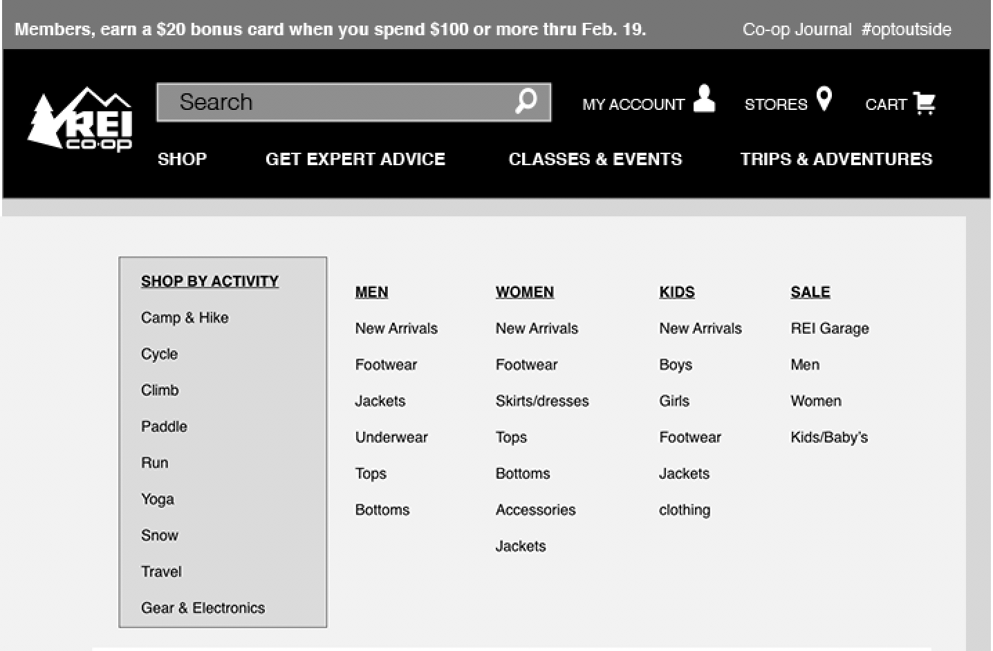
Original REI Top Navigation
Revised Version 1
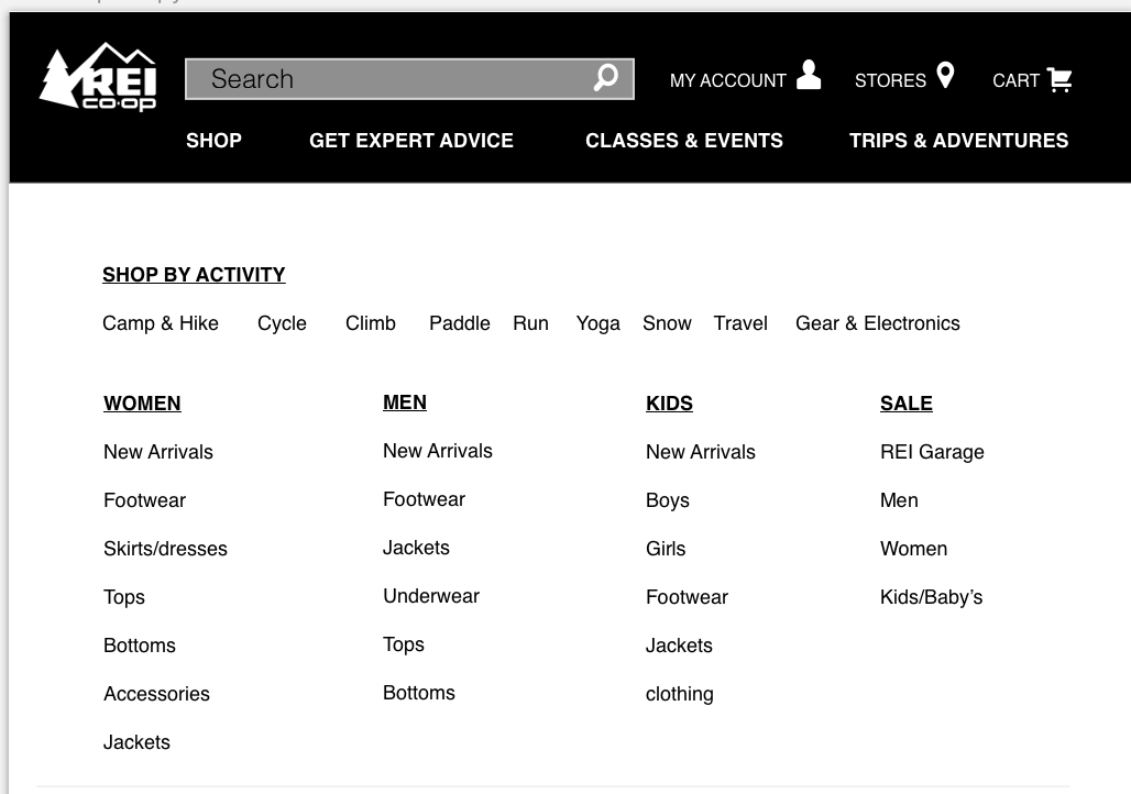
Revised Version 2
Usability Testing Round 1
Testing 5 Users, 1 being easy 5 being hard. On average users scored a 1.6 on Round 1 of Usability Testing
Testing revealed that people were unsure about what REI Co-op and #optoutside meant.
REI's original top navigation has to many options, so I condensed everything into the SHOP category, to give more room to the other great things REI has to offer, like their classes and events.
Testing also showed that there are to many ways to get to one product.


Usability Testing Round 2
Testing 5 Users again, 1 being easy 5 being hard. On average users scored a 1 on Ease of Use with 100% Success Completion Rate
Round 2 testing revealed that there was still confusion around what Co-op Journal and #optoutside is. The way I designed the Shop By Activity section was not easy to navigate.
Card sorting revealed that people like to shop by activity.
REI has so many different options for hiking boots, based on Trail Hiking or Snow Hiking etc. To make the process easier for the user, I combined everything into just a Boot Section.
When you click on Hiking Boot, you get all the boots and could possibly look for something more specific in the filters section.
Next Steps:
I think a good realistic next step would be to conduct another round of card-sorting on the shop section to see if things have been made more clear.
What did I learn:
Whew! I learned so much from this project. This one specifically was a heavy load. I learned so many new research concepts and techniques. Like card-sorting, and what it means to conduct a Competitive Analysis. I learned about Heuristic Evaluations and Contextual Inquiries. The process of re-building a website from a UX perspective is a big task, but lots of fun, taking something that exists and making it better and more understandable is rewarding.