Project Overview
OBJECTIVE
Our task was to design either a website or app that would allow students to upload their art works to be viewed and critiqued by other Teachers and Mentors.
MY ROLE DURATION TYPE OF WORK TEAM
UX Design 3 Weeks Client Work Myself
Usability Tester Lucy Zhao
Researcher Helen Pan
Xian Gu
THE CHALLENGE
In the past YANY has tried using social media platforms such as Facebook but they don’t work because a student may not have a Facebook account and those sites are usually blocked at school.
THE SOLUTION
An online platform where students can upload their work and share it with teachers and mentors to receive feedback.
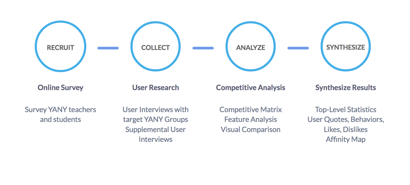
We started with Online Surveys, User Interviews, then we Synthesized our results
SURVEYS
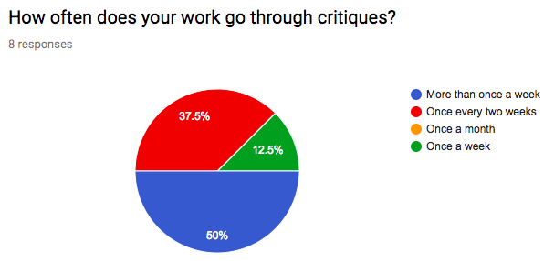
We Conducted 10 User Interviews asking questions like
What kind of feedback would you like to receive from your instructors and mentor.How do you showcase your work?
How do you feel about having an online portfolio
KEY INSIGHTS
Our key insights from User Interviews were that Students are often very open to criticism and try to implement it though they have a hard time remembering face to face feedback
Students are interested in seeing their progress over time, and have no easy way to do so. Social media is an imperfect platform for professional work.
"The things we teach them are post-college. We prepare them for the real world, and this class gives them the edge that they need."
LinkNYC Teaching Artist
COMPETITVE MATRIX
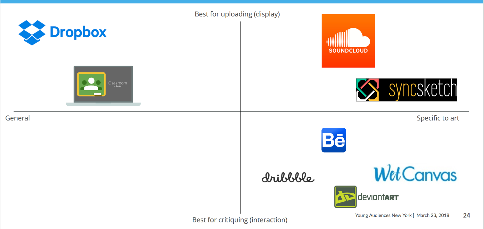
Zooming in, we split our 8 companies into 2 groups (competitors for general upload and comparators for the art community) and conducted a feature analysis to compare and contrast the different features each company offered. This gave us a sense of the scope of each company as compared with our own intended scope.
In all, we found that the most easy to use uploading services didn’t often coincide with the best commenting functions, and that the divide between general and art-specific sites was large
For our purposes, we drew inspiration from the visual look of Behance or Dribbble while maintaining the ease of use of Dropbox or Google Classroom
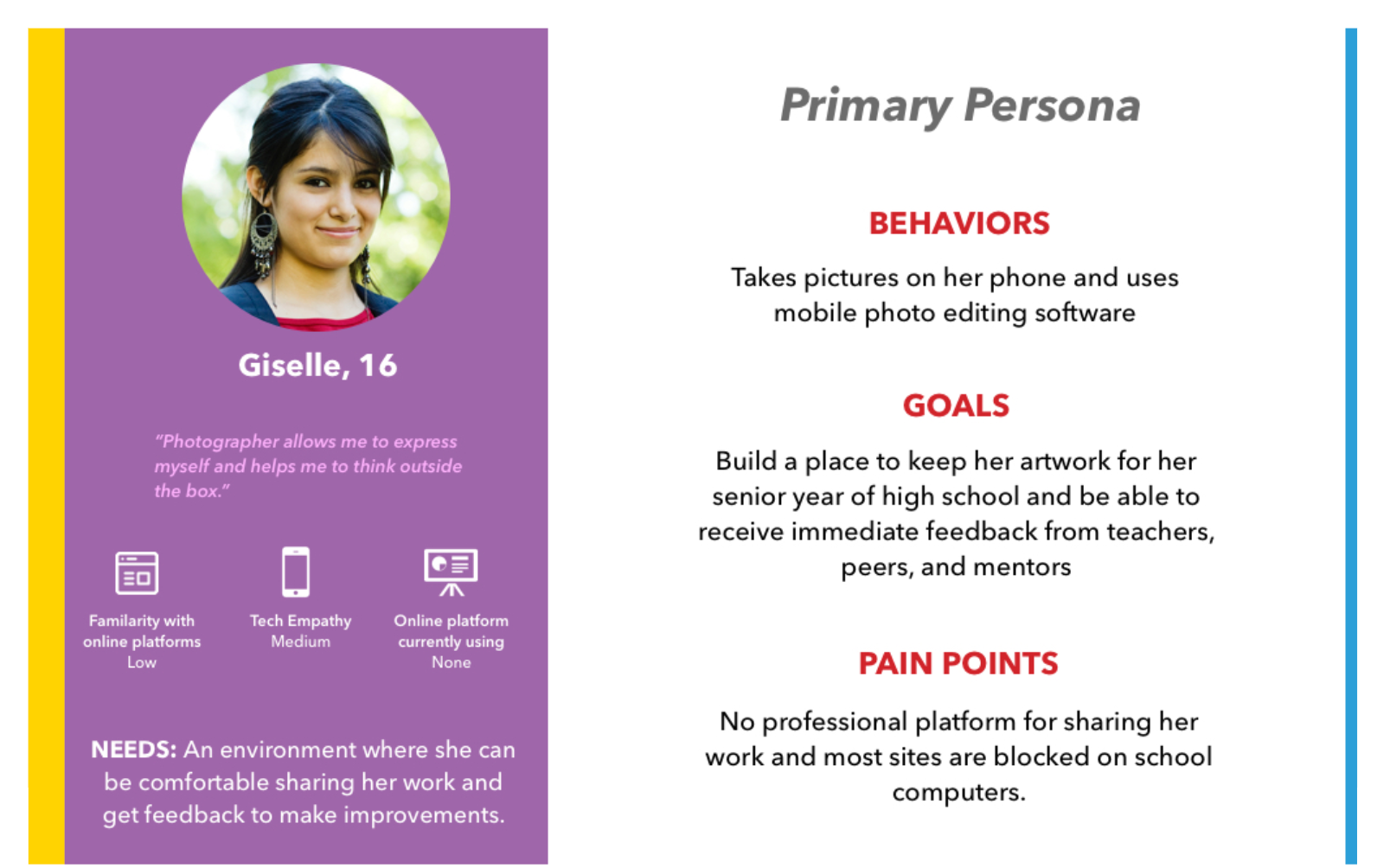
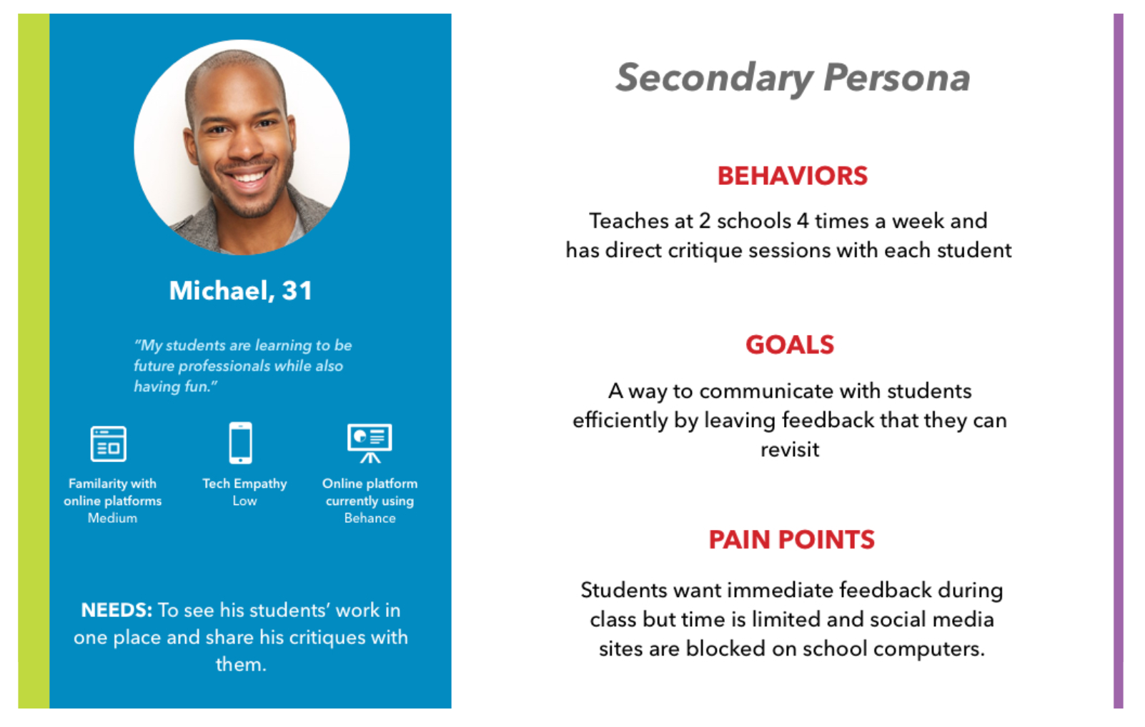
PERSONAS:
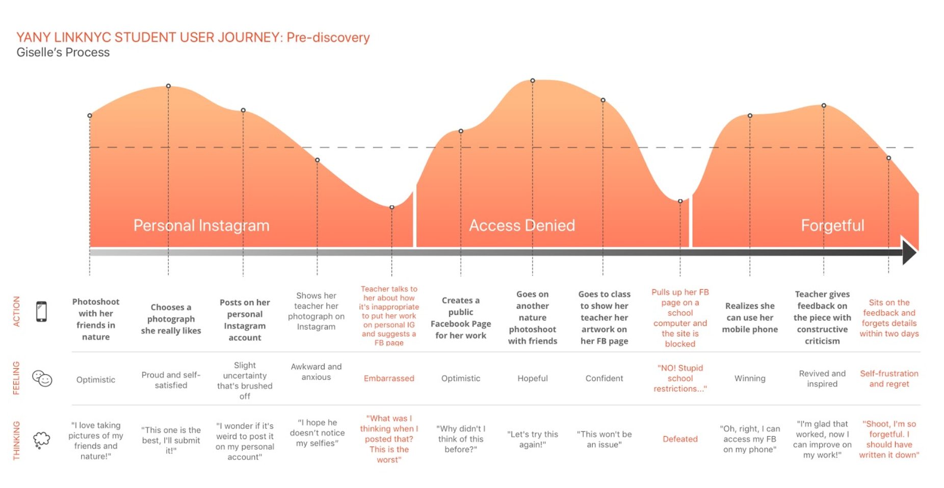
USER JOURNEY
PROBLEM STATEMENT:
Students currently don’t have a way to showcase their work online, making it difficult for teachers to give them feedback throughout their creative process, thereby limiting their growth.
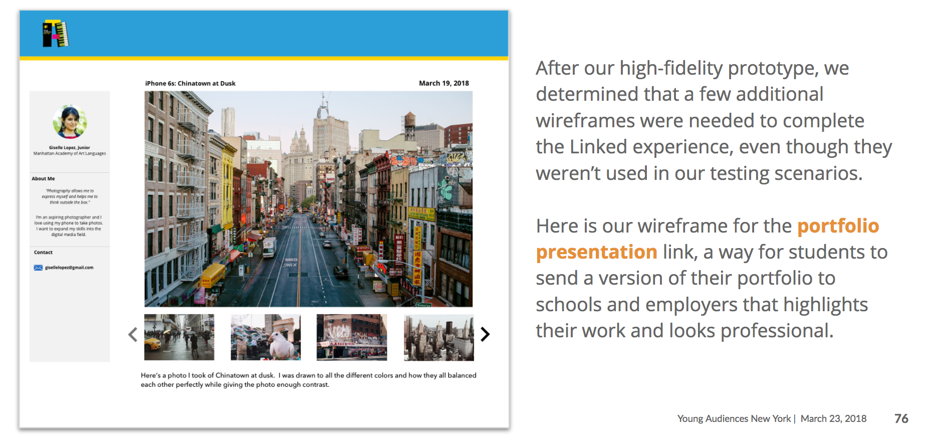
Giselle, an aspiring photographer, is a digital media arts student at a NYC Public School and needs a way to prepare for her future.
How might we set Giselle up for success and prepare for a her potential future in digital media with the proper resources and tools to get her there?
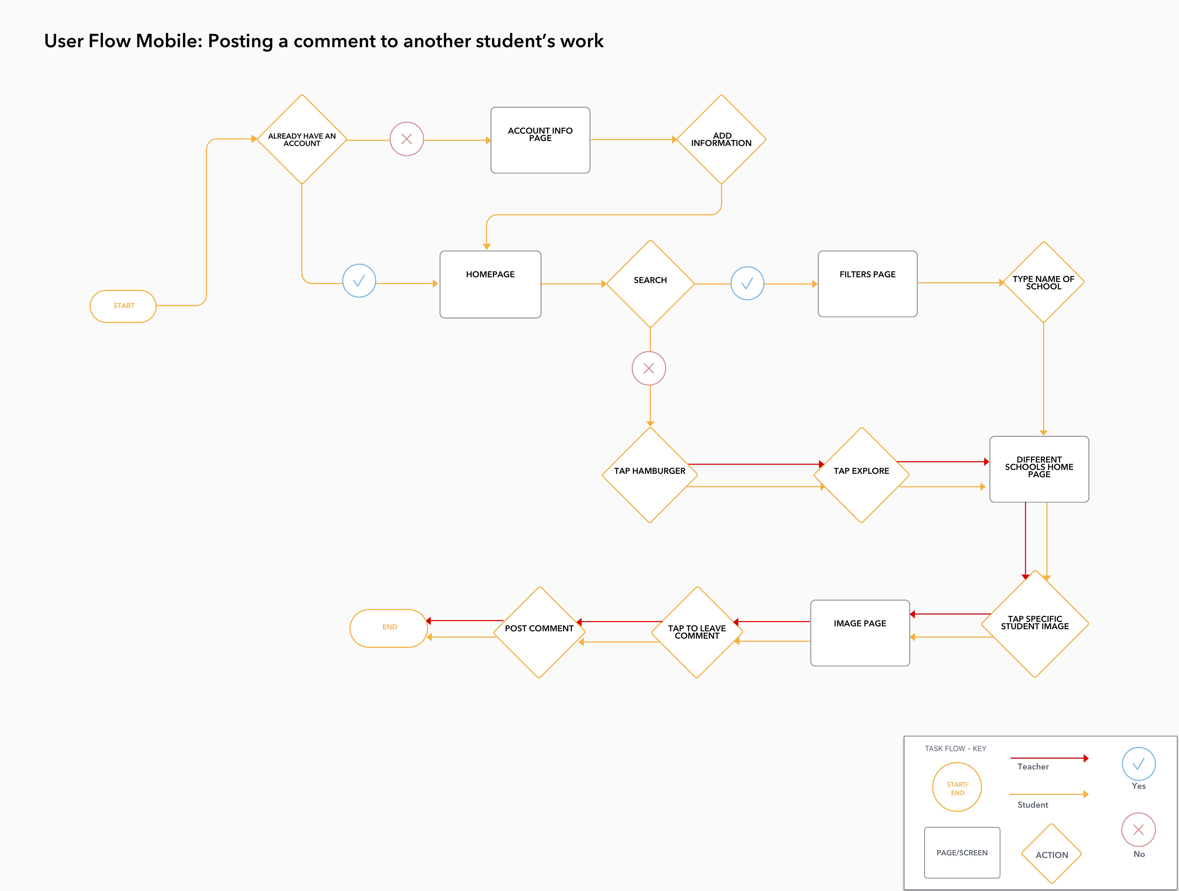
User Flow Chart for both teacher and student on the mobile site, exploring and leaving a comment on specific students work.
IDEATION
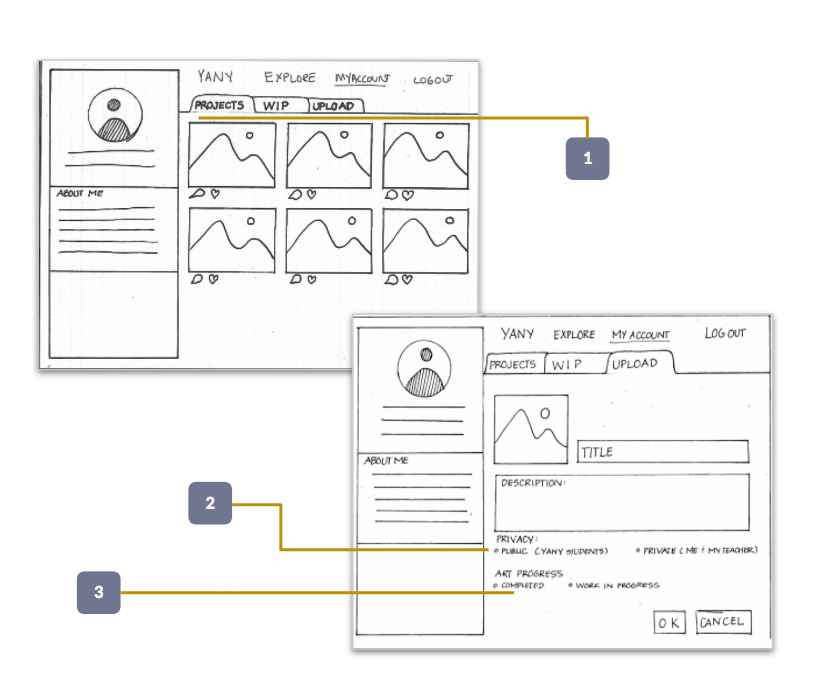
1. Projects & WIP Page: 7 out of 8 students expressed interest towards having an online portfolio to showcase their work.
2. Privacy: Students are concerned about who could view/access their work.
3. Complete/In-progress: LinkNYC students have projects that are completed for showcasing and have current works that they need feedback on.
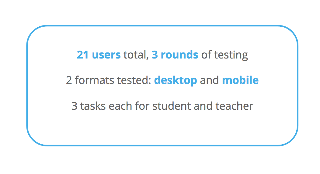
Usability Testing
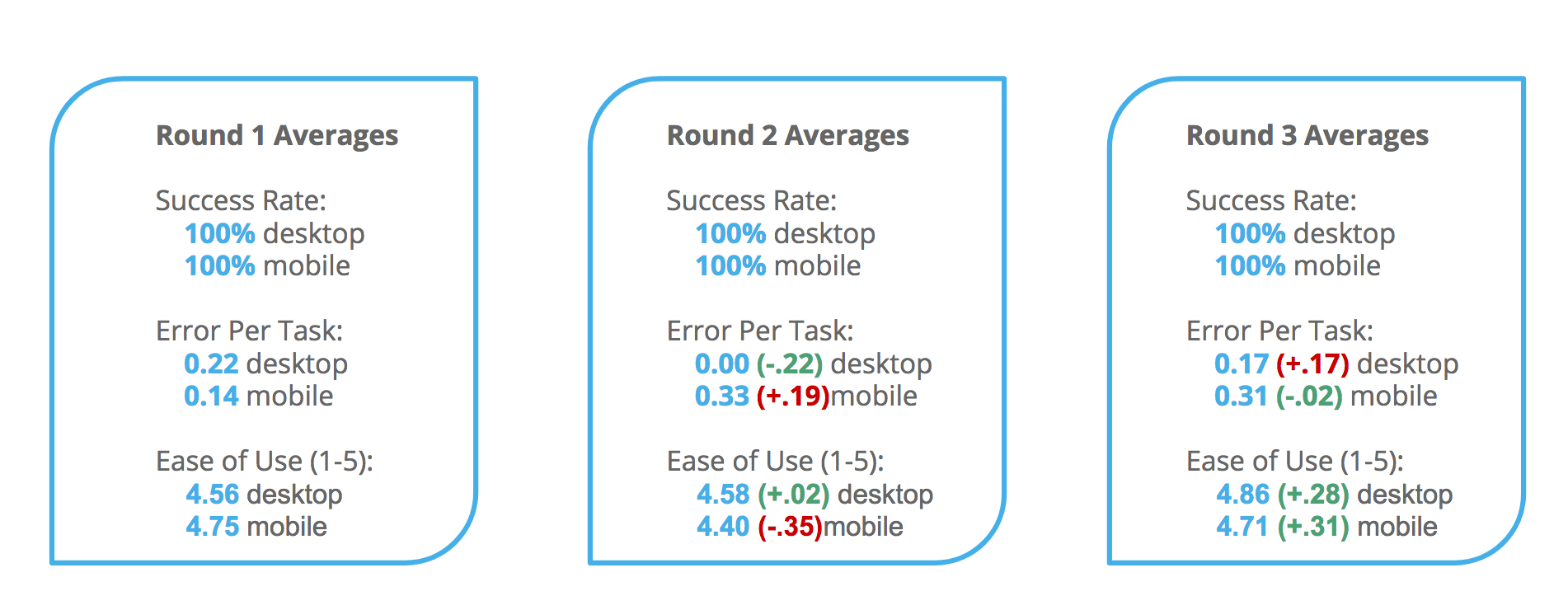
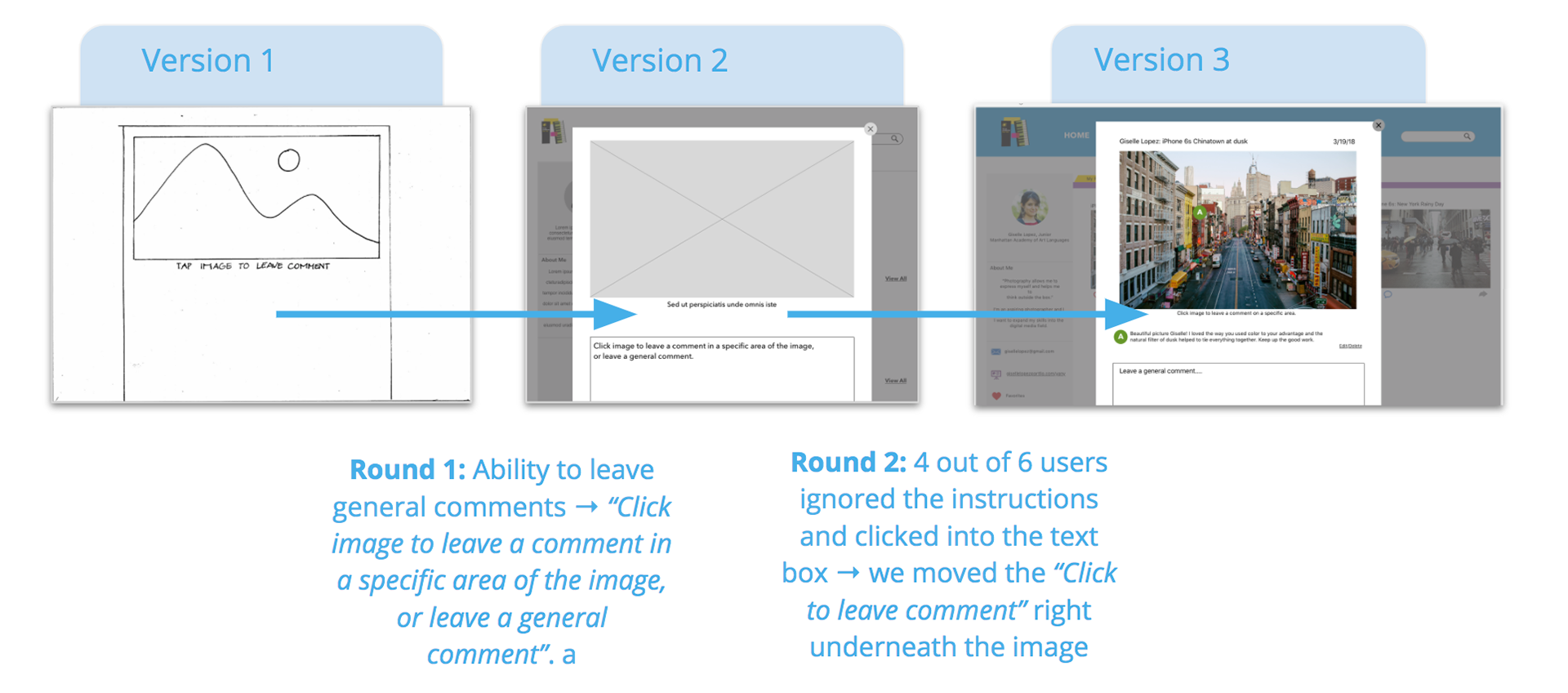
3 out of 5 users were confused why the notification symbols disappeared once you visited the notifications page, and also expressed confusion as to what the number of notifications was related to.
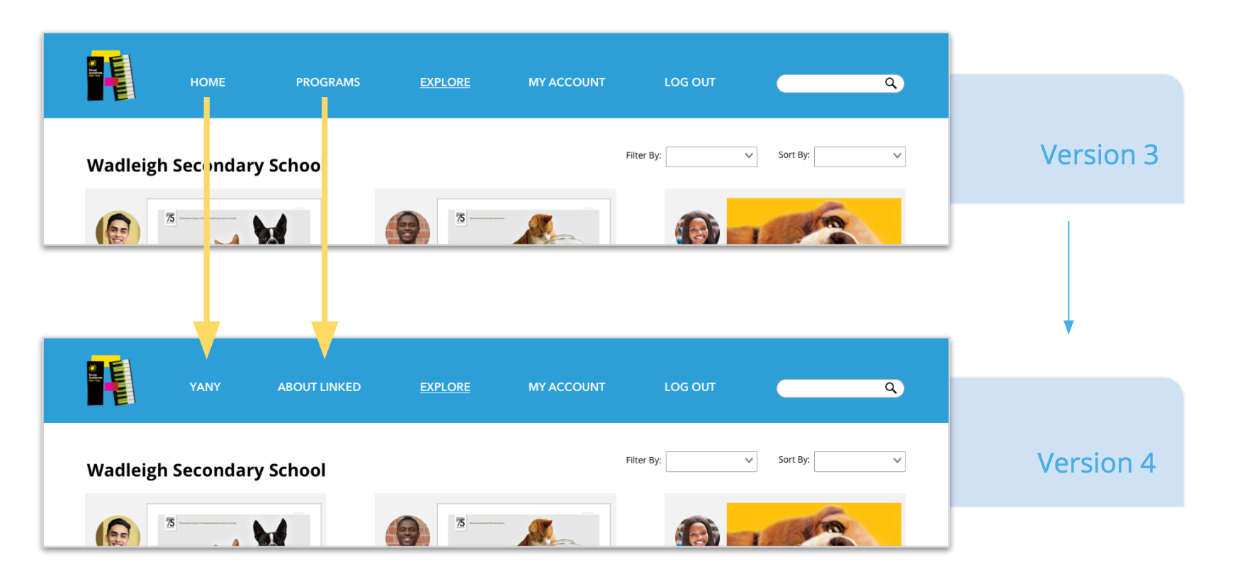
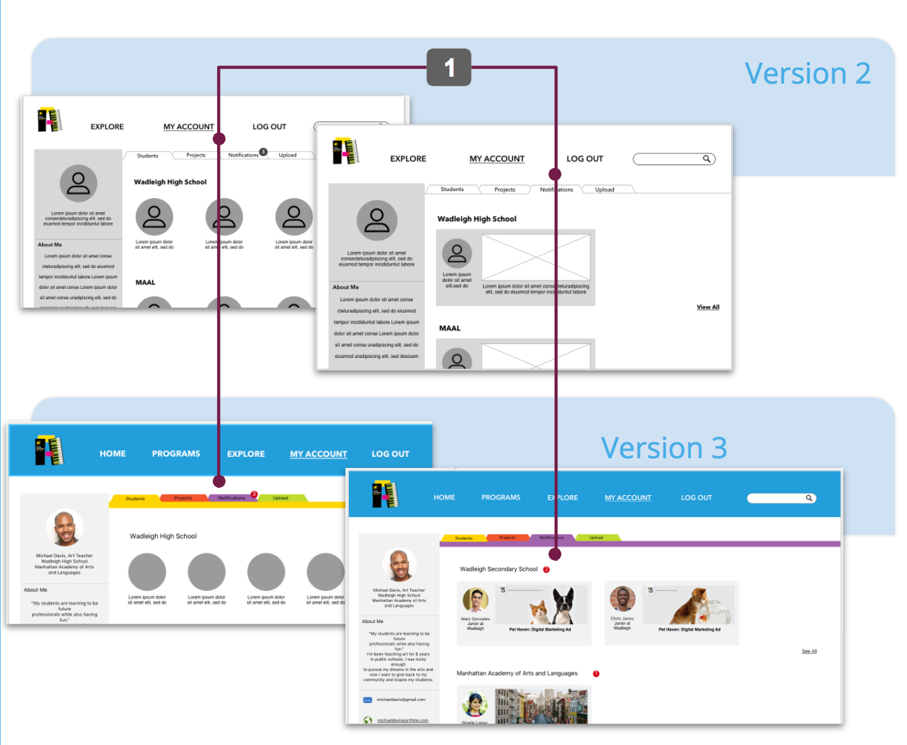
Global Navigation: 1 out of 6 users were unclear on what “Programs” meant in the global navigation, and did not know what “Home” was either. Based on such, we changed the “Home” to “YANY”, which would link to the existing YANY website, and changed “Programs” to be “About Linked”, as Linked is the platform’s name.
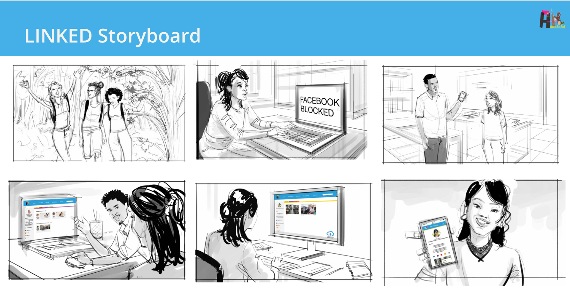
1. Giselle out with friends taking pictures of nature
2. She tries to upload her pictures to FB at school, but its blocked
3. Her teacher introduces her to a new platform called LINKED
4. She creates an account and uploads her work to the new website
5. She’s super stoked and shows off her new profile on the mobile site.
Possible Next Steps
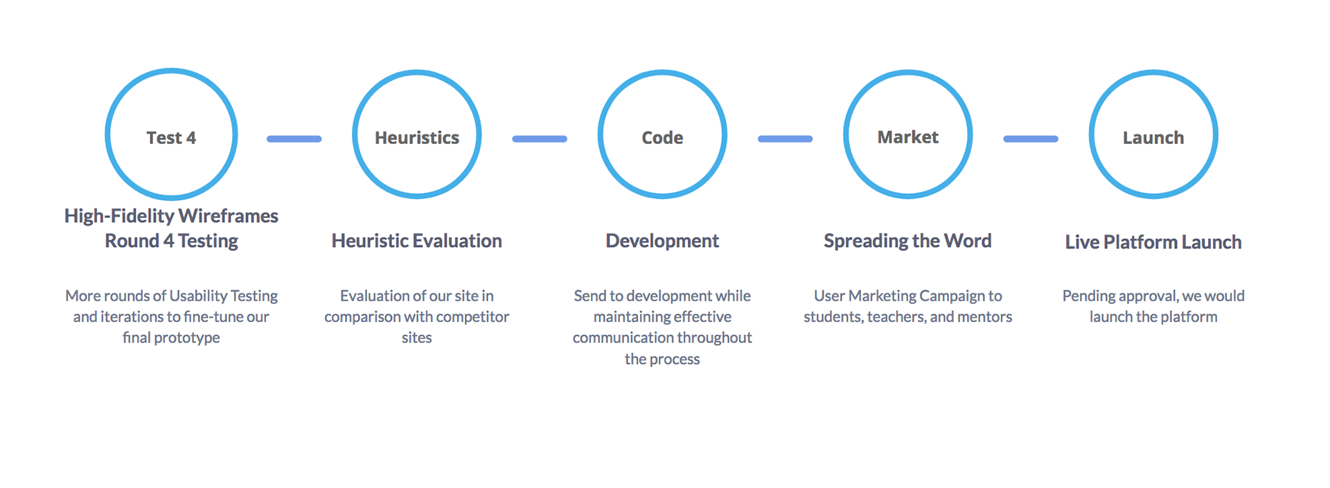
Link to Desktop website https://invis.io/UWGFR69C9KP
What did I learn
Being new to the UX Process, I learn something from every project. In this case YANY gave us a problem and potential solution. However through research and user interviews we were able to uncover deeper insights that were not expressed in our initial meeting. Users don't always know what they want, and I felt that the affinity mapping process was vital in finding out things like, students being really open to receive feedback on work and want the ability to show other students in their network. Affinity mapping is just a really cool process and way to get to the deeper meaning of what people want and need.